jquery sparklines charts in Angular2

Software engineer based in Singapore
Welcome to my website, where I write mostly on tech-related content to share the things I learned from people and from building projects using different tools.
My interests are in tech, traditional finance, cryptocurrency.
While working on my internship project that uses Angular2, I had to display some data in a nice chart that provides some interactivity. After browsing around for a while, I settled for the jQuery Sparklines pie chart. It uses <canvas> to draw charts(Should I use canvas or svg?), is simple and provides useful tooltip information when you hover over it.
For more info, check out the Sparklines documentation
Pie chart in action
Basic pie chart
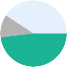
On hover
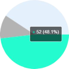
The Sparklines pie chart looks like this. The segment of the chart is highlighted and a tooltip is displayed when hovered over.
Getting started
- Load jQuery library
- Load
jquery.sparkline.js, which can be downloaded from the website - An inline tag in the HTML to display the sparklines chart(e.g.
<span>) - Call the
sparklinefunction to display the chart
Default line chart
The documentation provides a few ways to display the sparkline chart.
Ways to display sparklines
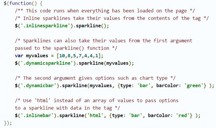
Pie chart example
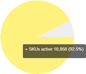
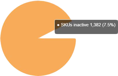
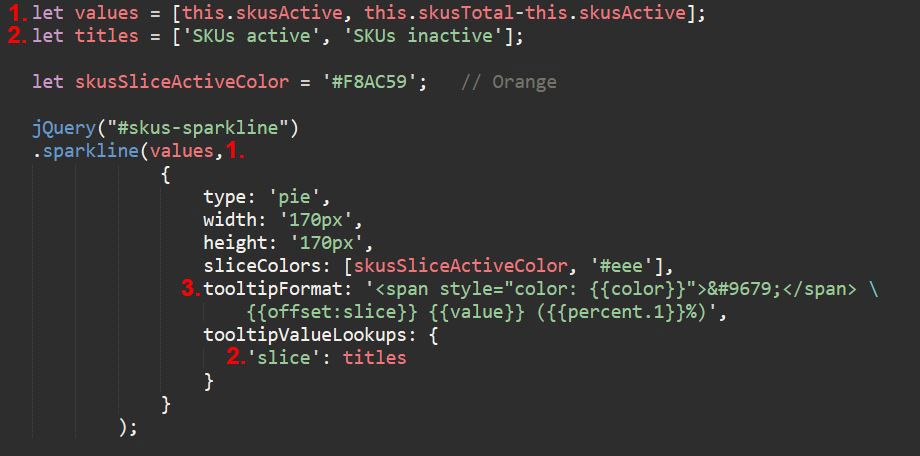
This is the code for my pie chart. I used the jQuery's selector to select my <span> tag, and call the sparkline function, passing in two arguments, an array of values and an object of options.
Code in Angular 2
1. Values
Put the values to be displayed in an array, which is passed in as the first argument to the sparkline function.
2. Labels Similarly, put the labels for the data in an array, which is to be used later in the tooltip.
3. Tooltip
We use the tooltipFormat option to format out the tooltip, and tooltipValueLookups option to provide the label to be displayed in the tooltip.
Everything in the span tag is used to display a small circle with the colour of the element, specified in sliceColors. offset is used to display the label name in the tooltip {{value}} displays the value of the element ({{percent.1}}) displays the percentage with one decimal surrounded by parentheses.
Besides writing simple code, the ease of customisation of the tooltip is an added bonus that provides a good developer experience.


